Intro
Humans are social species with an innate desire for communication and writing is for communication: it uses visible (or touchable) signs to enable us to pass on and receive contents of our minds to and from people who are separated from one another by time, space, or both.
Many scripts have been evolved at different times and in different places — at least four civilisations (Mesopotamia, Ægypt, China, Southern Mexico & Guatemala) are known to have developed an independent system for writing. This essay is focused on the alphabetic script evolved by the Romans; however, it is placed into a broader context of other writing systems.
This ancient technology [of writing] is at least 5000 years old; in western civilisation it can be traced back approximately 3500 years before the common æra, to ancient Sumerian documents in Mesopotamia — the southern part of Iraq.
For the Sumerians, writing was a pro bono from the god Nabu, the divine scribe; for us, writing is something that majority of people take for granted — something they do every day — without stopping to think about it. However, if one does stop and thinks about it, one might realise that it is very magical: taking the thoughts from the inside of one’s head and putting them out into another form, that can be understood by another human mind — even if they are thousands of kilometres away, or centuries in the future.
Writing systems: cuneiform & hieroglyphs
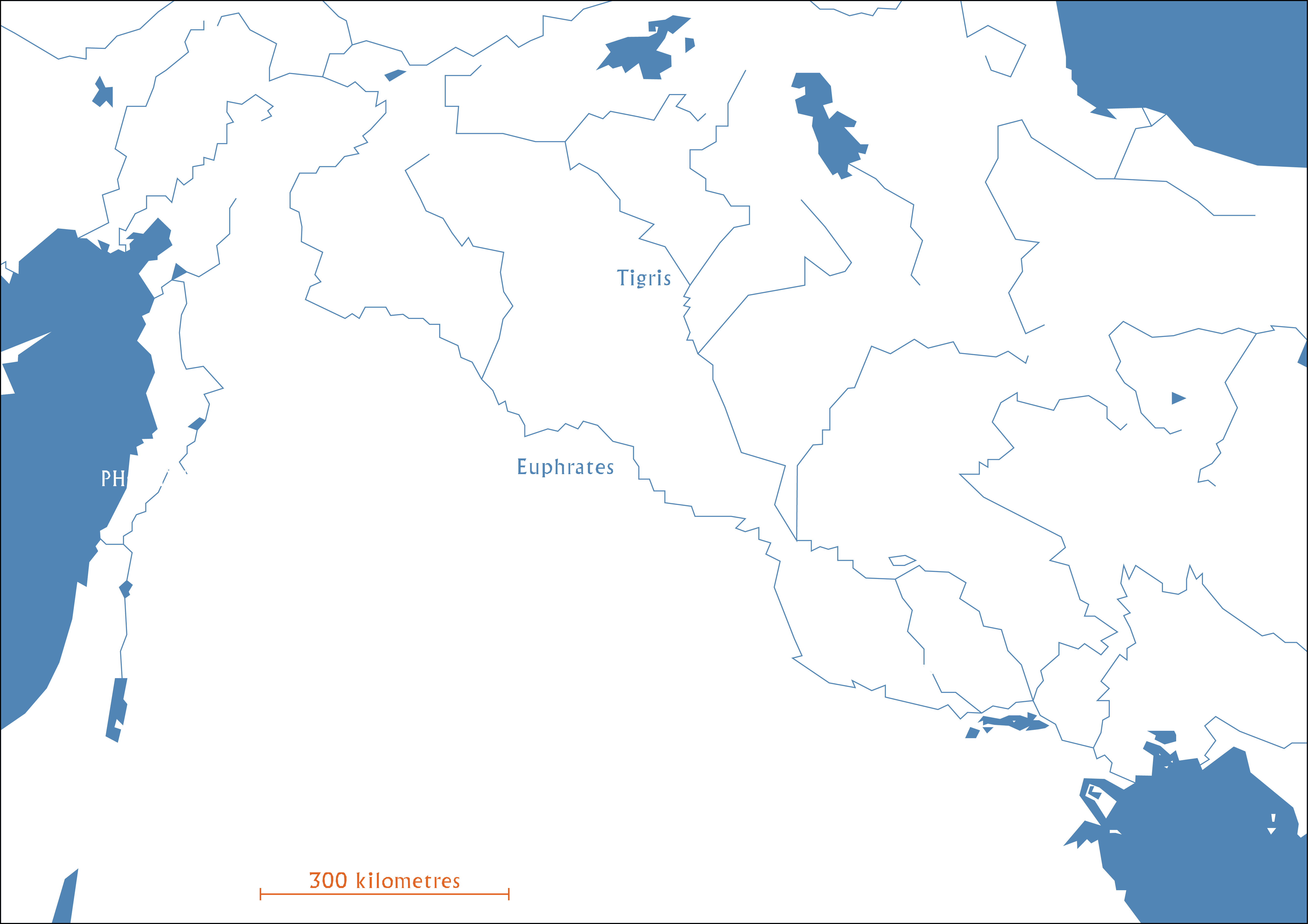
Most of the oldest cities in the world developed around rivers and there are several reasons for that: it provides water, habitats for plants, animals and prevents flood. Mesopotamia is not an exception: it developed by the longest and one of the most historically important rivers of Western Asia — Euphrates. Together with Tigris — another big river to the east — it is one of the two defining rivers of Mesopotamia, hence the meaning of region’s name (Land Between the Rivers.) The river has played a very significant role in the history of writing: Sumerians were one of the early civilisations that have learned the process of land irrigation, which increased the food production and eliminated the need to work for everyone — a key ingredient of a complex society. Another benefit was the richness in clay that the river had — the importance of this factor will soon become clear.
In order to make a record, first writing systems had to pass the stage of being small versions of things that they represent. Afterwards, it moves to the next stage, which is Pictographic: a word or an idea, represented by a small picture. Mesopotamians are the first civilisation to make this crucial step of making a connection between a real thing and a symbol of it. They etched pictures into tablets of moist clay — a material Euphrates supplied in abundance — with a tapered stylus. Once etched, the tablets were fired in ovens to harden them. This wedge–shaped writing — a cuneiform (a wedge in Latin) — possibly because of the difficulty of making curves — was gradually abstracted and developed into a systematic form — a set of symbols, almost entirely based on triangular marks (determined by the stylus they used) — before it disappeared around 1000 years BCE. This sophisticated inventory of symbols is not only capable of representing the full richness of the Sumerian and other languages of the region, but also has made it possible to write quickly and at a very small size — which is why it was so appreciated. However, another conceptual leap had to be taken in order to get where we are today.
In the North part of Ægypt, approximately 3000 years BCE, the first hieroglyphs appeared: developing from a pictographic stage, these simplified pictures of an object — that used to stand for the object — are now representing sounds. A logographic stage of the writing system — to which magical powers were ascribed at the time (hiero glyph = holy carving) — makes it possible to spell out words using pictures; its earliest form remains well–known — pictures painted on the walls of tombs and temples, reserved for nobles and elites.
Nota bene: the stages that show the development of writing systems are merely a form of examination rather than a rule — a writing system does not have to pass all of them and a complete transformation from one to another is not necessary. In fact, one of the most spoken languages in today’s world is partially logographic.
The ampersand
A widely used symbol (already seen in this text) in English (and some other languages), does not only have a phonetic value — it stands for an entire word (and).
A rich history of the ampersand can provide enough information for an entire book (this opportunity is already taken by Jan Tschichold,) therefore prepare yourself to perceive this part of the text as a brief introduction to it: the symbol came to light from the Roman streets as a word ‘et’ (meaning ‘and’ in Latin) in the first century of the common æra. The writer and the exact date of the ampersand being recorded for the first time is unknown. However, the volcanic eruption of Vesuvius circa 80 CE has preserved this symbol in a form of graffiti, which significantly reduces the range of possible dates.
The ancestor of the ampersand, which we use today, has advanced from something very similar to a ligature — two joined letters (‘E’ and ’t’); modern-day ligatures (most often used in English are: ‘fi’, ‘fl’, ‘ff’, ‘ffi’ and ‘ffl’) can be found in the metal type or digital typefaces and are used to avoid visually uncomfortable space between two individual letters (kerning). Although some ligatures carry only a decorative value, such as ‘st’ [which appeared in the fourth century CE (Roman cursive) and was retained in Carolingian minuscule script.
Coming from the pre-type æra, a letter combination ‘et’ has served as a time saving device: the final stroke of one letter led to the first stroke of the next one — a pleasing coincidence that has reduced the overall number of times when the contact between the writing instrument and the surface area is interrupted.
The first variants of this ‘ligature’ have preserved a phenotype very similar to the separated letters (middle arm of the ‘E’ touching the stem of the ’t’), which suggests an accidental origin, for instance — an anxious writer.
In addition, there is another symbol that possibly has derived from the ampersand — the mathematical plus (+) sign, often used as a simplified version of an ampersand. Unfortunately, a thorough investigation of this symbol is still yet to happen.
The Rosetta Stone
The Rosetta Stone is a carved inscription; made for Ptolemy V in 196 BCE from a block of granite (about 1m2); contains three versions of a text; represented in two languages and three scripts: Ancient Ægyptian texts in hieroglyphic and demotic scripts (demotic script is a simplified writing system, which became the most common form of writing for Ægyptians, until the beginning of the common æra, when it was gradually replaced by the Greek script at first and Latin later) and Ancient Greek text using Greek alphabet.
It is believed that the stone has been displayed inside a temple, near Sais — an ancient Ægyptian town in the Western Nile Delta; relocated at least once; used as building material in the construction of a fort, close to the town of Rashid (Rosette in French), where it was discovered in 1799 by the French army.
Although the stone was taken by the English army (publicly displayed in London, at the British Museum since 1802) 2 years later, the text was decoded by a Frenchman — Jean–François Champollion — in 1822. Being able to read both, Greek and Coptic (the final stage of the Ægyptian writing), made it possible for him to translate the hieroglyphs into a writing system that is more common in our time. The translation has not only given us meanings of the Ægyptian hieroglyphs, but also proved its multipurpose: it is pictographic, logographic and phonetic all together, since many pictures were literal representations or stood for the sounds of these words, accompanied by a set of images, that only had a phonetic value. Needs to be mentioned, that those discoveries did not happen all at once: content similarity of the three texts was noticed almost instantly after the stone was found in 1799, however, the qualities of a phonetic script (for the spelling of foreign names) within the demotic text remained unknown until 1802 and the similarity between demotic and hieroglyphic scripts in the context of phonetic characters were not discovered until 1814, following the latest last major advance in the decoding — native Ægyptian words spelt using phonetic characters in 1822-1824.
The Rosetta stone is no longer unique, since other (three) copies of the same decree were found together with several Ægyptian bilingual (or trilingual) inscriptions — three of them are even older than the Decree of Memphis (The Rosetta Stone): the Decree of Alexandria in 243 BCE, the Decree of Canopus in 238 BCE, the Memphis decree of Ptolemy IV, circa 218 BCE.
Hieratic < Demotic
A few centuries after the first hieroglyphs appeared, a cursive writing system, known as hieratic — simplified hieroglyphs — started being used: it was written in ink; on papyrus; with a reed pen; used for accounting and marriage contracts. Hieratic was the main script for Ancient Ægyptian from its development to the advent of an even more simplified system — Demotic.
The Demotic [writing] system became the most common form of writing (hence the meaning of its name — popular) for Ægyptians, until the beginning of the common æra, when it was gradually replaced by the Greek alphabet at first and Latin later. Nota bene: the word Demotic is capitalised to avoid confusion with demotic Greek — a term used for referring to Modern Greek.
Demotic script was used for more than a thousand years and — naturally — has experienced several alterations that has divided the history of it into three stages: early, middle and late. The early Demotic has developed in Lower Ægypt circa 650 BCE; was exclusively used for administrative, legal and commercial texts; after its spread to Upper Ægypt (due to political reasons,) it replaced hieratic and became the official writing system of Ægypt.
In the year 400 BCE Demotic entered the next stage — middle Demotic, often referred to as Ptolemaic. Over this period (until c. 30 BCE) Demotic has gained a higher status compared to its early stage, since its use for literary and religious texts has significantly increased. By the end of this stage the script lost its status as Greek became the new administrative language and oppressed it by making documents written in Demotic legally worthless, with an exception for contracts registered with authorities. However, a such exception had to be accompanied by a note, written using Greek alphabet. NB: Greek did not replace Demotic entirely: a significant decrease occurred at the end of second century of the common æra.
The last stage begins with the Roman rule of Ægypt, around 30 BCE, ergo it sometimes is referred to as Roman Demotic. The use of the script has been gradually dropping in public life since the Ptolemaic stage — the late (Roman) stage has only accelerated this process: Latin was spreading like a virus, taking over languages of the western part of the [Roman] Empire. After this stage, there was a very little use of Demotic and the last dated artefact is from the year 452 — a contextless graffito “Petise, son of Petosiris”.
Wadi el-Hol
Valley of terror is a translation of the name that belongs to an ancient road in Ægypt that was used by traders and soldiers. Along the road, there are many inscriptions in hieroglyphic and hieratic scripts. Even though those inscriptions were known already, in 1999, a professor of Ægyptology — John Darnell and [his wife] Deborah — discovered two of the inscriptions that did not seem like others of Ægyptian origin. The scripts, that were identified as different, were similar to the ones discovered near the Red sea [about 90 years] earlier, however, they had reasons to believe that inscriptions in Wadi el-Hol were older.
The date of inscription is estimated to be c. 1800 BCE, which not only pushes the origin of the alphabet back by at least 300 years, but also proves its relation to Ægyptian genesis. Nota bene: despite its relation and visual similarity to the hieroglyphic texts, the script was not developed by Ægyptians. It is assumed that Semitic soldiers, who worked for the empire at the time, developed a script to write their own language and a thorough observation of the little-used Ægyptians’ phonetic system has influenced them to develop it in a mimical manner.
Proto-Sinaitic → North Semitic
A collection of [thirty] inscriptions was found by British archæologist Sir William Flinders Petrie (1853 – 1942) in 1904: they were inside of a turquoise mine at Serabit el-Khadim, southwest Sinai Peninsula; approximately 3400 years old. These inscriptions used a variety of frequently repeated symbols, which indicates an alphabetic writing system.
One of the groups of symbols, was repeated enough to be noticed by Sir Alan Gardiner (1879 – 1963) in 1916 who was observing similarities between known North-Semitic characters and the symbols of Sinai: he suggested that the aforementioned collection of symbols stood for a feminine form of a name that belongs to a deity Ba’al — a widely worshipped god of fertility. The characters of these inscriptions are referred to as Proto-Sinaitic script. Still undeciphered symbols are considered to be a transition between Ægyptian hieroglyphs and North Semitic script — the most well-known variant of the Phœnician.
Ugaritic: back to basics
In western Syria, at the site of Ugarit a different alphabetical approach was discovered: while other Semitic peoples were adapting the pictographic writing system from Ægyptian culture to their languages, the people of Ugarit were developing a system similar to Sumerian cuneiform — abstract wedge-shaped writing.
The Ugaritic system did not survive long, nonetheless, it has outlived some of the more successful Phœnician developments, such as the cuneiform itself.
Phœnician — the purple script & the bird of fire
Proto-Sinaitic script — also known as Proto-Canaanite, or Old Canaanite script — has spread to Canaan (hence the name). It was then [locally] evolved into the Phœnician script. This decision — made by a small group of Semitic people (compared by modern standards) — to develop a collection of [twenty-two] letters has shaped the world we live in today — it is the first known script that is very close to an alphabet; rose beyond the Sinai Peninsula.
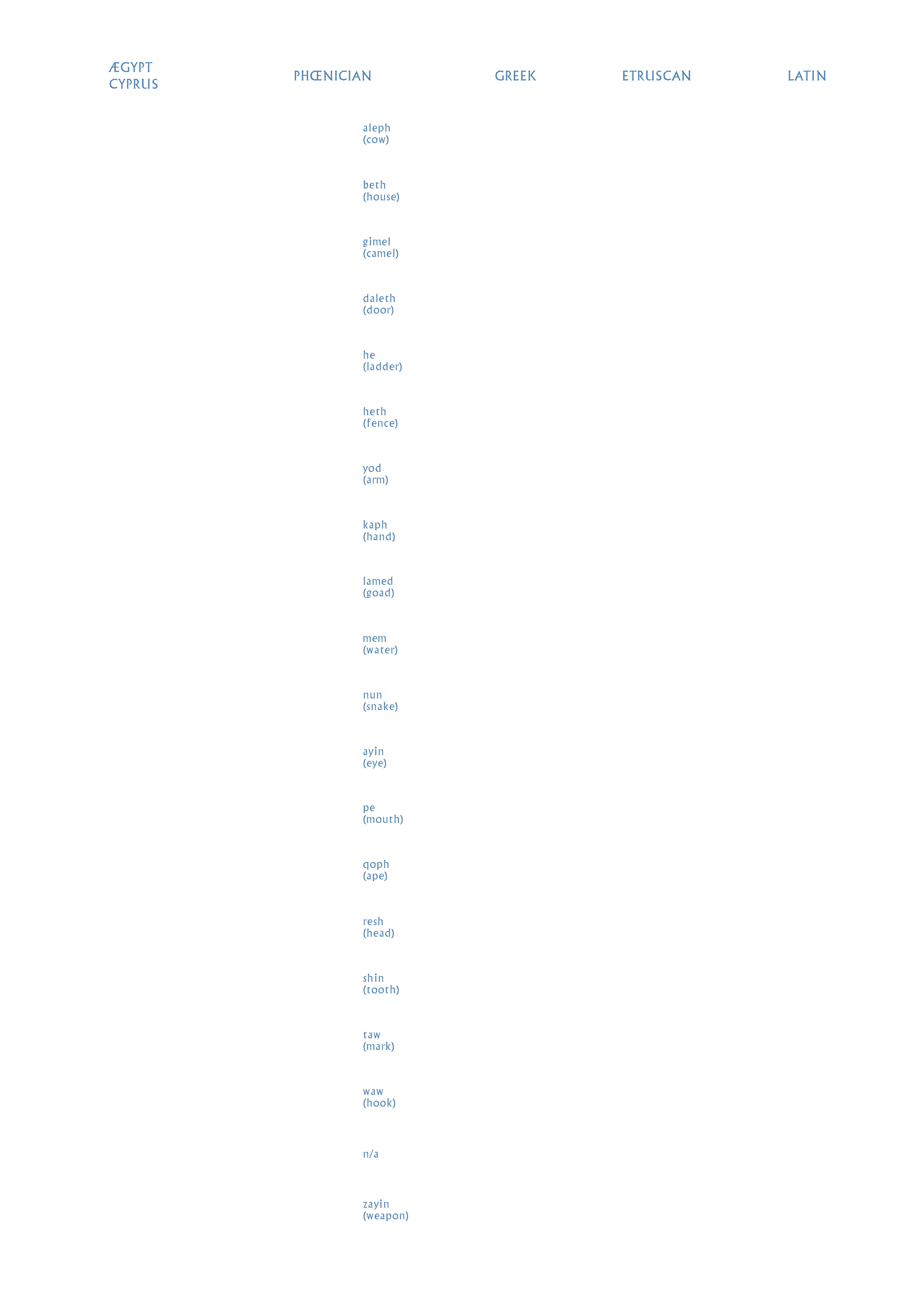
Phœnician letters evolved from simplified drawings, therefore their names directly resemble the origin of each symbol, for instance “A” looks like a cow’s head and was called aleph, because it also meant “a cow”; “B”, or bet, meant “a house” and, the initial shape looked like a cave, or a shelter; “N”, or nun, which meant “a snake”, depicts a specific manœuvre of the animal; et cætera. These meaningful names, that each symbol was assigned with, leads to an assumption that Phœnicians used a system called acrophony, meaning that the name of a letter begins with the letter itself. It is logical not only because the letter evolved from the picture, but also because it made them easy to remember. People did not have to come up with connections, such as “N is for Nuts” — the letter “N”, in this instance, is already “a snake” and even looks like one.
Jewellery, spices, fabrics, precious stones, &c. — the Phœnicians were great merchants; have sailed to every corner of the Mediterranean (the sea in the middle of the world). Over the years, they have exported their writing system to the countries which they had œconomic links with, such as Ægypt and Mesopotamia. One of the most famous cities of the ancient world — Carthage — began as a trading post for the Phœnicians and their [Carthaginian] scripts (Punic and neo-Punic) derived from Phœnician.
Using a sharpened reed as a writing instrument has once again affected the shapes of the letters: most notable modification is a rightward rotation of up to 180 degrees for some characters, possibly due to the natural posture of a hand.
Needs to be mentioned that Phœnicians de facto laid the groundwork for our alphabet that is Latin, nonetheless it would have seemed quite different from one another. Since Phœnician alphabet is an abjad, or, more specifically, a consonantal alphabet, it is not truly an alphabet — it is entirely composed of consonants, relying on a reader to supply the missing vowels. Moreover, they did not use word spaces or any other means of separating words and there was certainly no punctuation — it appeared many centuries later.
Apart from the consonantary [and other goods], Phœnicians had another greatly desired product of their own making — Tyrian purple. It is a purple dye with a well-paying client — the royalty, since the colour is synonymous with [and limited to] this social class. The dye was made by acquiring the defensive pigment of a murex shellfish (a snail of the sea.) It was a long process to go through: snails were milked or crushed and left to decompose. Not only the excessive amount of time it required, but also effort and a great number of snails had to be collected in order to make a single litre of dye, making it even more exclusive.
Another interesting link between this colour and the Phœnicians is the way Greeks called them — “the purple people” — and their country — Phoiniki, which is a Greek word formed from the word purple [or crimson] — (phoinix). It is hard to ignore the similarity between these Greek words and an immortal bird that cyclically regenerates — the phœnix. According to the legend, it lives in the dessert and every 500 years the bird consumes itself by fire, later to rise renewed from its ashes. The phœnix has been linked to multiple colours, however, sources provide no clear consensus about its phenotype. The Greeks have possibly assigned purple to phœnix due to its connection with fire and the sun and whilst the bird is associated with Greek mythology, the origin of it has been attributed to Ægypt, with several analogues that can be found in many different cultures.
Greek & boustrophedon
The Greek alphabet is the oldest one that has been used continuously after its appropriation made by the Greeks themselves around 800 BCE. For the Phœnician characters it meant losing their figurative aspects that have remained until then and becoming more abstract graphical symbols. The Greeks kept only the phonetic roots of each letter, therefore aleph — the cow — became Alpha; bet (a house) — Beta; nun (a snake) — nu; et cætera. The word alphabet originates here: from the first two letters — alpha and beta. The people of Greece were also behind a major innovation — the vowels. They altered and expanded the collection of Phœnician letters; found certain consonants that did not have any corresponding sound and thus, were useless for writing their own language. These letters became obsolete or, in some cases, were recycled (reassigned a new sound). The Greek alphabet eventually came to contain seven vowels: A, short E, long E, I, short O (omicron,) long O (omega) and U — a significant addition; this has made the alphabet not only more useful, but also more compatible with other languages, since many of them require a rich record of vowel sounds. This has made Greece into a channel by which all of Europe became literate and acquired the alphabet.

Additionally, Greek scribes were used to writing boustrophedonically — inscribing the first line of their documents from right to left, and the second from left to right, &c; changing direction within the text, starting the next line below the end of the previous one. This is a style of writing known as boustrophedon — it is an Ancient Greek term, which means “turning like an ox [whilst ploughing]” and it required not only a change in the direction of writing, but also turning the lettershapes themselves to face that direction. Although this practice was quite popular among ancient civilisations — such as Etruscan, Greeks prior to them and the Romans after — it did not last very long — just long enough for certain letters like B, E, or P, to be permanently flipped.
Eventually, two versions of the Greek alphabet came to be the standard for Classical Greek, whilst the eastern alphabet was the one that travelled to the Italic peninsula via Greek colonists in the south and became the alphabet that Etruscans adopted as their own.
Etruscan
Greeks made settlements in Sicily and southern Italy from the 800-700 BCE onward; called their new land The Greater Greece (Magna Graecia). A new settlement — Cumae — founded by Greeks from the city of Cuma (on the island of Euboea) acquired that same alphabet of Greeks, which is believed to be the source of the Etruscan alphabet.
The Etruscans inhabited the Italic peninsula before the Roman Empire, in an area called Etruria (the western part of the country). It is one of the reasons behind a great influence they had on Roman culture: significant part of their culture was transmitted [from Greeks] to Romans through Etruscans. Even the famous icon — the Lupa Capitolina — is an artefact of Etruscans.
The language they spoke in Etruria was not Semitic like Phœnician, and not Indo-European like Greek, it was not related to these or any other known language. It was a very different mother tongue, one of its peculiarities is the lack of voiced stops (b, d and g). Despite that, Etruscans de facto had those letters (and the sounds themselves). However, the record of their writing is much richer than the one of their spoken language, since it was quickly replaced by Latin. The modern Latin alphabet does not have some useful letters, such as long E (eta) and long O (omega), because the Greek alphabet was not done being modified when it was taken to Etruria and just like they took over the Greek alphabet of that time, Romans took theirs — an alphabet they used for about 800 years. Finally, the Etruscan alphabet, used in an area that covered seven countries, was no longer used before the beginning of the first century of the common æra.
Latin
Around 600 BCE, in the Italic peninsula, people of Latium established a group of villages; expanded them and formed the city-state that we know today as Rome, from which the Roman Republic and Empire grew. Eventually, they superseded the rest of city-states founded by [other] Italic people across the Latin peninsula. One of them was the Etruscans.
The Romans soon started to appropriate the Etruscan alphabet, to suit their own needs. They brought back new letters that the Etruscans hitherto had not used and invented some new ones. Moreover, The Roman Empire introduced new writing technologies that accompanied their Imperial letters: more symbols for punctuation, small letters, [word] spacing and even a script family, which laid the groundwork for the very engine of graphic design — typography.
Roman writing: capitals
The Trajan’s column was a tool of Romans to boast about the emperor’s (Marcus Ulpius Traianus (53 – 117), also known as Trajan) victory in the Dacian Wars. The base of this monument features the most accomplished, most beautiful, and most famous example of the Roman alphabet. Those letters that were used to present the text of the monument in Rome were CAPITALIS, from CAPITELLVM, which is a Latin word that means a ‘head of column.’
Those letters have inspired a typeface, designed by Carol Twombly (born 1959) in 1989. The typeface is called Trajan, since it is designed to mimic the Roman script and is based on lettershapes inscribed on the column of Trajan; it was supposed to share its class and majesty. Ironically, it is not adequate for typesetting in Latin. Nonetheless, the digitisation of the Roman alphabet became very popular, and very soon it was used on [too] many film posters, television shows, book covers, &c. — anything that a display typeface could suit (preferably in large sizes.)
Twombly was not the first one to tackle the square capitals of the column, in fact she was at least fourth [after David Lance Goines (1945), Frederic William Goudy (1865 – 1947) and Bruce Rogers (1870 – 1957)]. Carol Twombly’s version of Trajan differentiates itself from its ancestor in several ways: width of certain letters (‘N’ is narrower; ‘S’ is wider; et cætera) and the serifs, that are quite subtle on the column, are more pronounced on a screen. Those alterations were necessary in order to preserve its visually pleasing qualities, since those inscriptions initially were meant to be placed very high (on the column of Trajan), read from a great distance and therefore letters were designed to fit these needs.
Apart from some common words that are spelled in an archaic manner, I have deliberately used several Latin words within this essay — even the very first one (intro) — that are present in the English that we use today. Another English word with Latin roots is majuscule — it defines letters that are bigger, compared to the rest between two lines and it comes from the word MAIVSCVLVS, which means ‘somewhat greater’ (in the context of letters.)
Further development of the Roman alphabet demands a differentiation, since they introduced different styles of capital letters. It led those refined letters on monuments to be called CAPITALIS QVADRATA (square capitals), since O is proportional to a square, which arguably was a guide that they used to model each letter. This term has survived, and its meaning has not changed, even though the letters have variable width — for instance, O has twice the width of letters S and E. Nota bene: the term ‘square capitals’ is used to refer to younger, smaller script, written in books with a quill.
As it shows in the chart, The Romans did not have lower-case letters — in fact, they did not have any case — every letter they used was a majuscule, which is the reason why Carol Twombly designed more fonts to accompany the Trajan family without the lower-case. The alphabet acquired from Etruscans was not notably different — it was even occasionally used to write boustrophedonically. One of the examples of boustrophedon in Latin texts is the oldest (Latin) inscription — The Forum Cippus in the Roman Forum.
Later, Roman letters became Republican capitals with a small and quickly noticeable change — absent of serifs. Republican capitals did not last very long, similarly to the Roman Republic, since they [letters] were developed further, into a form that is more elegant, well-proportioned and became the Imperial capitals of the Roman Empire.
Centuries of practice led the Romans to a creation of a method that helped them rationalise the proportions of Roman majuscules — using tools, such as a compass and a set square. A useful and lasting creation was then introduced — the serif. It is a small feature, a slight projection at the end of strokes; the etymology of this word is unclear, nonetheless, there are some arguable guesses of its function. Some people say, it worked as a set of guides that helped during the process of carving; others say that its existence is purely for increasing readability. Evidently, serifs form an imaginative line, which is easier to follow compared to a sans-serif letter. Oppositely, there are people arguing that serifs have nothing to do with that — one reads best what one reads most. It all makes sense, which leaves us with an open case (pun intended). However, if serifs in fact do have a purpose, it is only there to help — a carver, a regular reader, or any other recipient, interacting with this tiny feature that has outlived the Roman Empire itself. That puts some people into thinking that it is a tradition, which we should respect and certainly not leave behind. I agree with this, but at the same time I do not think that there is a choice left anymore, since a great part of type design classification systems is based on recognising the type of serif, which increases its importance in the present time even more.
At this point in the history of Latin letters, there were two types of script — capital and cursive letters [with Rustica somewhere in the middle.] Capitals were the ones from the column and cursive letters were like a calligraphic script, meant for papyrus, parchment, civic notices, et cætera.
The octothorpe
A symbol, that is seen more often than some letters, a symbol, with a name that varies almost as much as its uses, a symbol that comes all the way from the ancient Rome — ‘#’. Unlike the pilcrow, whose lineage of Greek ‘paragraphos’ and Latin ‘capitulum’ is witnessed plainly by a succession of ancient manuscripts; unlike a symbol, such as an interrobang, that first appeared in 1962 (proposed by Martin Speckter (1915 – 1988)) together with a thorough explanation of its etymology; strong evidence of both the octothorpe’s appearance and its name is challenging to find.
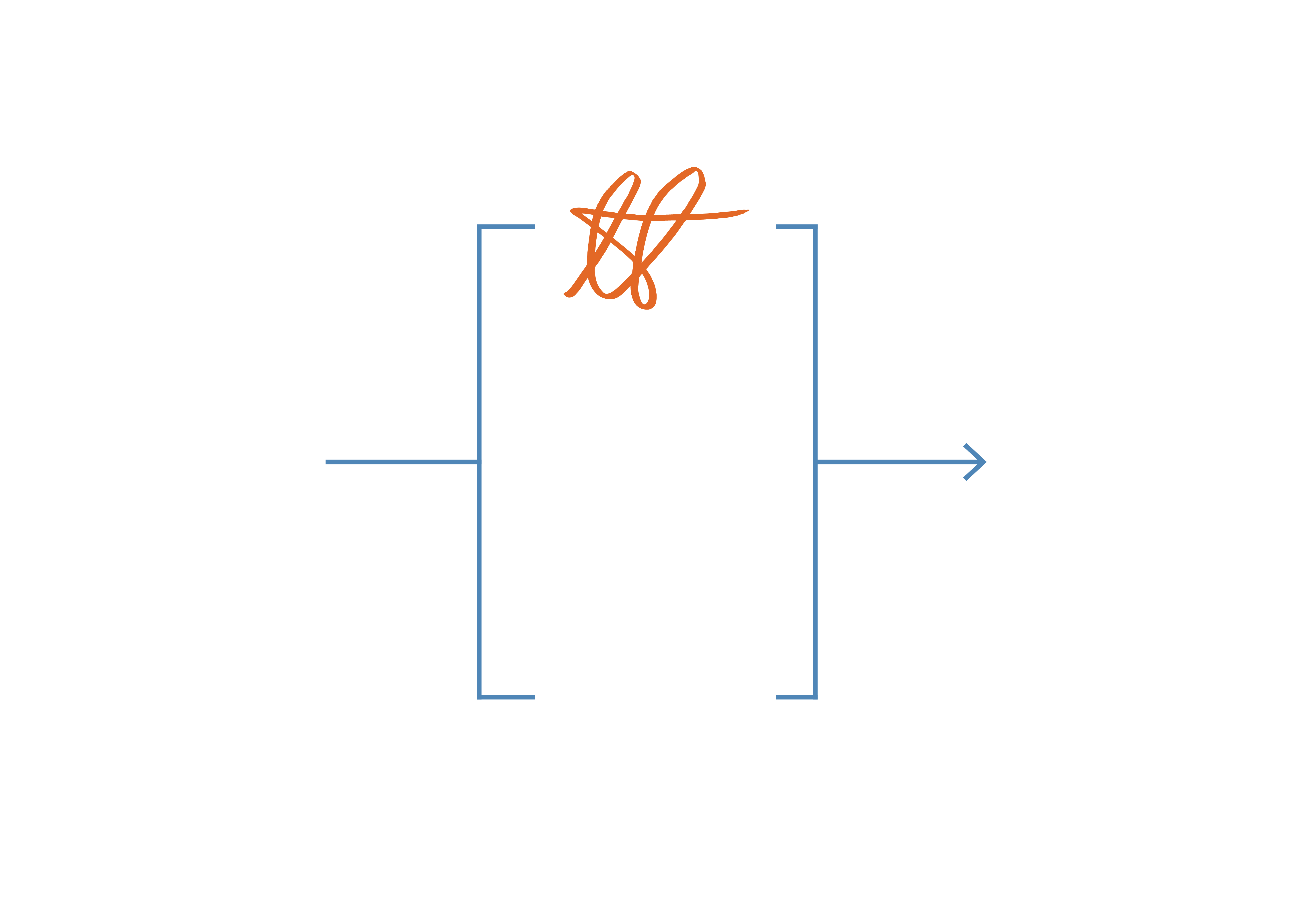
The Latin for a pound in weight is ‘libra pondo’, where ‘libra’ means “scales” or “balances” (hence the namesake constellation) and where ‘pondo’ comes from the verb ‘pendere’, “to weight.” The tautological flavour of this pairing is borne out by the fact that both words were also used separately to mean the same thing — one pound in weight — and it is from these twin roots that the octothorpe gets both its form and its oldest name.
Circa 1300 the abbreviation ‘℔’ (which stands for ‘libra’) entered English; according to common scribal practice, it was accompanied by a tilde (sometimes referred to as tittle), placed above x–height to denote the use of a contraction. Additionally, the corresponding abbreviation — ‘oz’ (ounce) — has a similar genesis: Latin ‘uncia’, or a twelfth part of a unit (that initially was a Roman pound), became the medieval Italian ‘onza’ and was shortened to the abbreviation that is still present in today’s world. This [‘℔’] abbreviation was used very often — some early printers even started to cut this pair of letters onto a single punch [which makes it a ligature]. However, a careless and rushed movement of a pen has transformed it into ‘#’, which shows below, where I imitate the pen of Sir Isaac Newton (1643 – 1727) [in orange.]
Roman writing: rustica, cursives & the development of the minuscule
Rustic capitals were adapted from the Roman capitals for a greater ease in writing by hand. It was more relaxed, compressed, quickly written analogy of Square capitals. The writing instrument they used for this script was a broad edge, often flat brush. A squared-off tip gave a rise to modulation — stressed and unstressed strokes. This — what essentially is calligraphy — together with a pace of writing that was gradually increasing, helped the lower-case (NB: the term is younger than the thing it describes) to emerge. Rustic capitals appeared in manuscripts for a few centuries and was soon replaced by 1 Uncial and 1/2 Uncial cursive scripts.
Since the majuscule letters (used exclusively c. 100 BCE – 200 CE) of the Roman alphabet were resistant to a quick, daily writing, a new script was slowly shaping itself to suit the ever- changing needs. It is the script of Roman cursives, which can be split in two styles — majuscule and minuscule cursives [or early and late].
Early cursive was complicated in comparison to the Square capitals, nevertheless — recognisable. The beginning of the minuscule can be seen in this script already: ‘H’ loses the upper right part of its stem and ‘R’ is written with as little as two lifts of a page (two strokes). On the other hand [although quite often in the same hand], the later cursive was harder to read. A combination of a thin line and seemingly unnecessary ligatures and loops produced an exceptionally beautiful illegibility that was present circa 200–600 CE. Further development of the Roman alphabet is highly influenced by this very script and what started in the early (majuscule) and Rustic scripts, continues to grow with Uncial letters.
This writing was developed for the fast-growing industry of book production. Together with casual, daily writing everything was confidently taken over by Uncial script, as it looked formal, yet easily readable and writable. Moreover, advance in writing technologies encouraged the use of curves to take the place of the excessive number of straight lines. Eventually, forming an ‘E’ required a similar movement as ‘C’; ‘D’ received a small addition on the top, while ‘A’ started leaning to a side; and ‘M’ lost its sharpness.
Even more roundness and shrinking was introduced in the half-uncial script of the Latins (hence the “half” within the name); a growing demand of books has increased the need for more plants (papyrus) and animals (parchment); however, the demand and supply was not proportional — while one of them was growing (demand), the other one was decreasing (supply). This has forced the letters to take less space and, naturally, less paper [or parchment]. As a result, the letters, such as ‘a’ became as round as the bottom part of the ‘b’; ‘d’ has pushed its centre of mass closer to the baseline, while ‘r’ has lost about half of its weight.
In the period of 750–887 BE, a dynasty of The Franks, called Carlovingians [or Carolingians] oversaw 2/3 of Europe. Their most famous king — KAROLVS MAGNVS, or Charlemagne (747–814), was a man behind a great goal — creating a new script; a script, based on Latin [and Insular]; easy to read; and most importantly — consistent throughout the empire. The script they created was the Carolingian minuscule — a script that became the base of the most popular alphabet in the world [of that time]. The letters on this page appear in a form that was agreed on back then, the work done by the Carolingians in literacy was not only the final development of the lettershapes we still use today, but also thoroughly defined textual organisation and the page layout. They [Carolingians] are the very reason, why I started this [and any other] sentence with a capital letter, just like they are the reason for a full stop being placed after this word.